Fixing Twitter Syndrome On The Web
I Paid For All The Pixels, I'm Gonna Use All The Pixels
I recently purchased a 2560x2880 monitor, which has exasperated problems that I have had with the modern web for a while now, particularly (but not exclusively) with blogs.
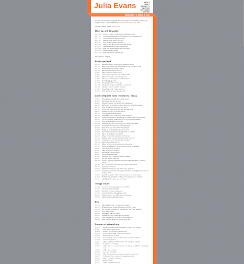
Behold, Julia Evans's blog. This website is extremely narrow. I have a hidpi display, and on my screen the main content of this page looks like a pole running down the middle of it, wasting all of the space on the side. I understand the desire to have some padding for visual niceness, but this is excessive. The main bar of this page already has padding inside of it. Look at that orange piece. Look at the tasteful white padding on both sides of the text. This section is the piece that was made to be looked at, but I can barely look at it. This grey part of the website leaves behind just 20% of the space on the page, which is insane. 80% of this page is wasted grey space that I don't want to see. The image here has been scaled down, which is why it is blurry.
Julia is not the only one guilty of this. This is a problem that plagues the Internet, and it is a problem that gets worse when you get a hidpi display. This isn't a problem created by my aspect ratio, and it isn't a problem created wholy by my resolution. This is a problem with how websites are designed. You will run into this same design with:
- The StackOverflow family of websites
- Any readthedocs page
- Most WordPress blogs
- Most statically-generated blogs
I am not the only one to deal with this, this effects all users of the Internet and it particularly effects users of hidpi displays no matter their aspect ratio. If someone were to visit Julia's site on a regular 4k monitor, they would run into the same frustration. In fact it looks nearly as bad on a 1080p screen. The only time that these sites take full advantage of the display is on mobile browsers, and that is because they serve different CSS on mobile browsers since people would riot if you took away the already-limited horizontal space on telephone screens.
Twitter Syndrome
This design seems to immitate Twitter, where it makes some amount of sense. On a website where everything that you would want to read is 140 characters or less, you don't want the text to start at the far left and go all the way to the right. If you had that design, everything would be less than a line. My site is designed to use as much of your display as you let it, and this is what 140 characters looks like:
This line is 140 characters in length. I think Twitter may have expanded to 280 characters recently but I don't really keep up to date there
That's the maximum. If that was how Twitter was rendered, people might actually realize that they are spending their time reading things that lack substance. Twitter and similar microblogging sites trick the user into thinking that the text on the page is important by making it big and padded on all sides and visually isolated. Instead of allowing the content of the site to create the value, they assign a value to it by shiny visual webdesign.
This design philosophy has infected sites where the content is meant to shine on its own, without this anti-user trickery. It has come to blogs and technical documentation, where you want to display as much information to the user as you can at any time. This plague, Twitter Syndrome, has spread across the web and is getting worse. As displays continue to become higher and higher resolution, sites will get narrower and narrower. Where will you draw the line? One tenth used space? One twentieth? How will you even draw a line on a website that you don't operate?
Claim: It Is Better This Way For Eyeball Fatigue
Some might claim that this system is superior to using all of the space on a page because it reduces eyeball fatigue. The claim here is that instead of moving your eyeballs all the way across the screen when you hit the end of a line, you only have to move them a little bit to start on the next line and continue reading. The proported benefits (of my strawman) are two-fold:
- Reduced physical eyeball movement
- Less mental pause between lines, allowing you to better keep focus.
If your eyeballs are so weak or your attention span so short that you cannot read a wide line, I implore you to get off the computer and go outside. If a wide line is too big for you to fit it into your field of vision, then that is a problem with distance to your monitor + size of the text + aspect ratio. Modern aspect ratios are another evil thrusted upon the the citizens of the world, but that is a topic for another blogpost.
This design philosophy also produces an over-reliance on the mouse scrollwheel, since you constantly have to scroll down to see more of the page. This eventually will create hand fatique which is way worse than eyeball fatigue because at least you can close your eyes, you can't detach your hand to make it stop hurting.
Regardless of all of this, the most pressing problem is that these websites look stupid. Any arguments about the benefits and impedements are secondary to your website looking like a barbershop pole is sitting in between the user and the screen. That's the real problem, that it looks like I'm sitting in solitary confinement when I'm looking at your website, and that's a little too poignant for being on the computer.

Not A Real Solution: Ctrl+Mousewheel
Some people might say "bro just hold down control and scroll up" like that is a real solution. Doing this will usually get rid of ugly horizontal bars. It will also make the text so abysmally big that it can be seen from Mars. Additionally, many sites will start to break and look like shit if you zoom in far enough. I've seen images scale disproportionately to the rest of the page, CSS elements that are meant for one small thing in the corner taking up the entire page, and some sites that allow your zoom to change the size of the text but nothing else.
Zooming in isn't a solution to the problem. Zooming in is a solution to the site being too small, not being poorly designed.
Not A Real Solution: Just Use Half The Screen
If you instead think that you can just snap the window to take up half the screen and be done with the matter, I am sad to disappoint you. The grey bars will (probably) be smaller, but they'll still be there. Additionally, this solution isn't really future-proof. As your screen gets higher resolution over time, this problem will just come right back. A half-screen window on an 8k display has the same horizontal pixels as a fullscreen window on a 4k display. The impending creep of pixel density will come and leave none spared.
Not Everyone Is Like This
Some websites take advantage of your whole screen. These websites are pretty well designed and I think that they will last a long time. The hall of fame includes:
- Richard Stallman's Website
- Shy Studios
- The Toyota Information System
- Wikipedia (before the recent change in layout)
- SaltProject Documentation
A Real Solution: Modifying Other People's Websites With userContent.css
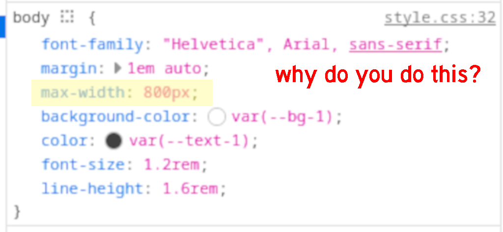
This problem is created by the website developer(s) making choices about how they want their site to be displayed. They make these decisions in CSS. Maybe there's some way to do it in Javascript but I haven't been cursed with experiencing that yet. If you open your inspector panel in any web browser and click on an element, something somewhere should be able to show you the CSS rules that are present for that element. If you look around enough, you will eventually find one that is set to width or max-width, or sometimes both. This field can be set to a font size, a number of pixels, or a percentage (there might be more options for values, that's all I've found). I think that setting this to a specific pixel count is the worst way that Twitter Syndrome rears its ugly head. When you set your max-width to a number of pixels, you are guaranteeing that you will need to adjust it again in the future when higher-resolution displays become more common. If it is set to a percentage, at least your website will look the same for the rest of eternity, even if that look is stupid.
I use Firefox, which gives me various tools to customize my user experience on the web. I'm not sure if this could be replicated in Chromium and friends, I don't use those web browsers very frequently. I can simply click on the offending CSS value and type in what I want it to be. The website will be updated in realtime in my browser so I can see the effects of my changes. Doing this allows me to set the width of different parts of the page. I can make Julia's site from earlier take up my whole screen, which makes reading her blog a lot easier.
My order of operations for a site goes like this:
- Go to a website that is shaped like a skyscraper
- Mouse over the section that is stupid and Right Click -> Inspect
- Hover over the different HTML sections in the inspector and watch
the various parts of the website get highlighted until I find the right
one, then click
- You'll know that you have found the right tag to work from when it is the highest-level tag that highlights the problematic portion of the site.
- Look in the CSS pane of the inspector until I find width or max-width. Sometimes it is a different key with the word padding somewhere in the name but that is less common.
- Click on the value of the aforementioned CSS and change it to 100%
- Enjoy the website no longer looking stupid
This solves the problem on most websites and they become usable again. Sometimes it is quite difficult to find the CSS element to modify for some part of the page. I have found this sometimes with sidebars. For this, I like to open up the Layout panel (you have to have the 3-pane inspector toggled for this) and click around in there until something looks right.
This is all well and good but your changes won't persist across page reloads, and they are only for the page that you are on. If you do this for a page and then click a link to another page on the same site, you're screwed. To remedy this, you need to make your changes persistent. There have been various browser plugins to accomplish this throughout history, but this is actually a feature that is built into vanilla Firefox, albeit poorly documented. Everything that I talk about here was tested on Firefox 117.
To save these changes, you need a chrome/userContent.css
file in your Firefox profile directory. That directory is
~/.mozilla/firefox/something.profile-name/. You'll have to
look and see what your profile directory is named, since it will be
different for everyone. This is different from the
userChrome.css file that you use to customize the browser
itself. Note the difference in filenames: Content vs
Chrome. If the directory and file don't exist, then go
ahead and create them. You'll also need to set your
about:config key
toolkit.legacyUserProfileCustomizations.stylesheets to
true if it is not already set.
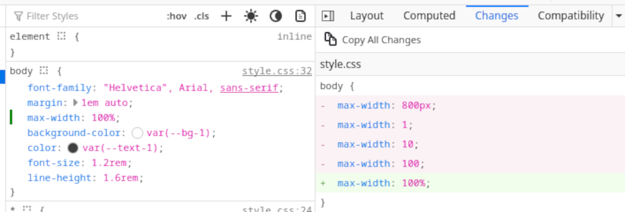
You need to get the modified CSS out of your Firefox. You could look at it with your eyeballs and copy it down by hand, but that is error-prone and requires you to have a working knowledge of CSS, which I don't (look at my website). Fortunately Firefox has got you covered. If you open the 3-pane inspector and go to the Changes tab, there is a nice big fat Copy all changes button which will put exactly what you need into your clipboard.
Inside of your userContent.css file you will need to
create the magic CSS that will overwrite the website's CSS. Use this as
a template, except using your copied CSS changes from Firefox:
@-moz-document domain("readthedocs.io") {
  .wy-nav-content {
    /* max-width: 800px; */
    max-width: 100% !important;
  }
}
Note that the !important part of every value that
you modify is critical. The userContent.css file will, by
default, only add new values to pages and not overwrite
existing values. This is unless your values are labelled as
!important. When you copy the changes out of Firefox,
it doesn't bring that !important tag, so you have to
type it yourself.
Once you have made your changes, you can simply restart Firefox (NB: Hamburger -> History -> Restore Previous Session if your Firefox remembers things between sessions) and you will have all of your changes. Here is a copy of my userContent.css which contains snippets for some sites that I used while figuring this whole thing out. I hope this helps someone.